Abstract Questions
What happens when art meets dress
Hi there! Hope summer is treating you beautifully.
Greeting from my book-writing hermit hole. It’s fascinating how different it is from making an audio documentary, mostly because the information is so diffuse. In audio, I mostly work from interviews that have been transcribed. Now, for this book business, I have to pilfer through the piles of books, archival articles, and interview transcripts to find whatever measly fact I’m chasing after. It sort of takes forever! I don’t know how you non fiction writers do it!
However. I did not mean to pop into your inbox to whine. In fact, I come bearing a little midsummer gift for you!
The art podcast, The Lonely Palette, is a huge inspiration for how I make Articles of Interest. Tamar Avishai, the host and creator, has this tantalizing way of breaking down works of fine art, even pieces that you think you know, and making you wonder at them anew.
I have always wanted to work with Tamar, and finally got a chance to commission her to write the essay I have always wanted to read: about the intersection between fashion and fine art. I hope you enjoy it as much as I did.
Is fashion art?
It should be a simple question. It’s not like there should be obvious tension here. Fashion is, after all, the art of the clothing world. Designers can express otherworldly artistry through fabric and form and sheer imagination. That said, in the words of Karl Lagerfeld, “art is art. Fashion is fashion.” And when one starts to pick at the bigger, more abstract ideas behind fashion, its connection to fine art can start to, so to speak, unravel.
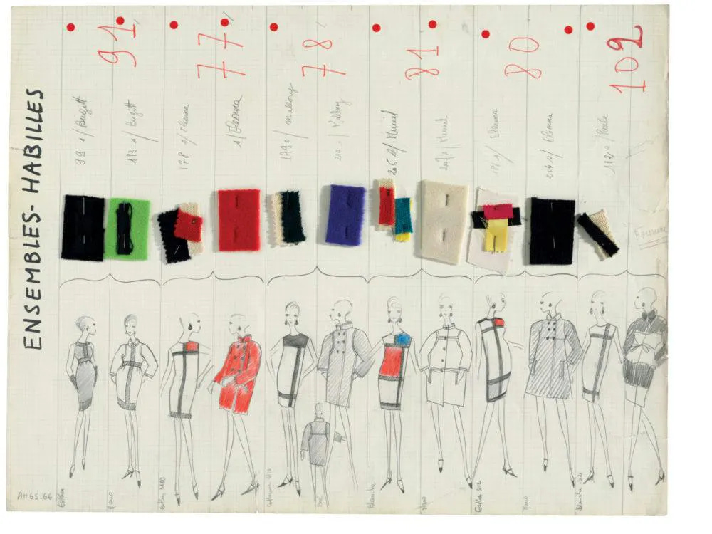
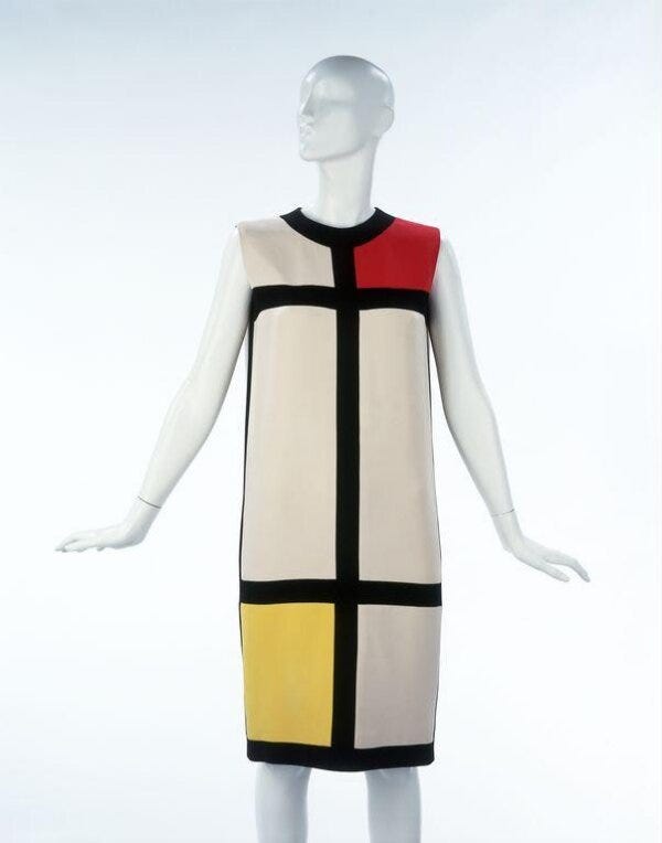
Just look at those babes. When Yves Saint Laurent released this Mondrian-inspired A-line shift dress for the autumn 1965 season, he declared admiringly, “Mondrian is purity.” These dresses came as close as any dress could to making Mondrian’s transcendent vision wearable, with their clean, graphic lines and strikingly two-dimensional form. But…how close could that really be?
The notorious cliché about abstract painting - that is, “my kid could paint that” - is that something simple must be easy to make. And sure, look at a canvas like Piet Mondrian’s “Composition with Red, Yellow, and Blue” from 1927 and you might think, well, really, how hard can it be? But of course, the inherent art of it doesn’t come from simple shapes and colors. It comes from what something so simple must mean.

A quick and dirty historical summary of abstraction traces its roots to Russia in the 1910s, where non-representational art was meant to be a political rallying cry. This was supposed to be art for the people- for illiterate farmers who wouldn’t have been able to decode paintings based on literary narratives, but could surely recognize a square.
The intended popularism of abstraction totally backfired. Because then, like now, abstraction felt intimidating and withholding. There’s something alienating about not having a clear “meaning.” Yet, as the 20th century roiled on - through the devastation of a World War, through industrialization - the simplicity of these abstract shapes and colors became more and more appealing. They became a way to represent what was inherently unrepresentable: our trauma, our subconscious, our spirituality. This art, these images that provoke questions instead of providing answers, invite us to probe our deepest human emotions. Or, in Mondrian’s case, transcend them.
Mondrian painted to cleanse. In describing his work, he wrote, “the clarity of technique accompanies the clarity of ideas.” These simple forms provided much-needed spiritual purification of the mind and the soul following the brutality of war. Mondrian’s stark rationalism became a tool for meditation. The slightly off-center squares and rectangles possessed a deeply balanced asymmetry, a “dynamic equilibrium,” in his words, that pulse and buzz and breathe with meditative calm.
Granted, this particular sense of calm comes from a particularly subjective place. Mondrian famously despised the natural world. It’s been said, perhaps apocryphally (although I hope not), that he would ask to face away from windows at restaurants because looking out at nature took away his appetite. And Mondrian’s hatred of nature, it would stand to reason, extended to all of us who occupy it: us war-mongerers with our foibles, hungers, and imperfections.
Mondrian therefore made it his mission to crack the code that would leave twentieth century human messiness behind him – or below him. He wanted to look towards a transcendent utopia of linear squares, primary colors, straight lines, rationalism, instead of flawed human curves, which, he sneered, were so emotional. The organic line reeked of frailty, subjectivity, death and despair. Maybe all art was always meant to go in this upward, ninety degree direction. And maybe his art was (as he claimed) the last art that ever needed to be made.
Of course it wasn’t the last art. And you can’t help but wonder what Mondrian, who died in 1944, would have thought of what later happened to his famous rectilinear forms.
Saint Laurent’s Mondrian shifts have been described as a feat of dressmaking: every seam is invisible, every line is straight, even when placed on our annoyingly curvy human bodies. And so Saint Laurent made dresses that spoke to purity, or at least as close as one could make in clothing.
And yet. They are still dresses. They’re still subjected to the same volume on a body, the same creases, the same movement as any fabric. Mondrian intended his forms to stay stock-still on a white wall, to meet your gaze, to purify your intellect. They’re not meant to move, to slink, to be fabulously modeled and then shed into a pool of silken jersey on the floor at the end of the day.
So was Yves Saint Laurent willfully not catching the snap? Or was Mondrian willfully obtuse to the fact that we can never actually transcend the world?
And here we have it, the great knotty tangle. Is fashion art? And the reason this question becomes so complicated is - and I want to be clear - not because I’m imposing any judgment or hierarchy about either fashion or art. I adore them both. I simply find myself curious about what constitutes each at its core. For all of their overlap, they are two fundamentally different things:
Art is a spiritual aesthetic exploration that retains a kind of inner dignity independent of its function, while
Fashion is about bringing aesthetics to our daily lives, making a statement about who we are through what we wear.
Another way of saying all of this is that clothing - obviously - has a utilitarian purpose. Art, if we’re being honest, does not. Art feeds our souls, but it doesn’t, quite literally, cover our butts. Furthermore, art can be literally anything, sometimes to its detriment. Fashion, no matter how dangerously avant garde, no matter how pushed, stretched, and sculpted, has a natural end point - which is that it still needs to be the thing it is. A dress can stretch every possible dimension of creativity, but it still needs to…be a dress.
Maybe what I find so compelling about the Mondrian dress is how a designer like YSL can theoretically miss the original plot and still create something so beautiful and iconic in its own right that in the eyes of history, the misinterpretation - or reinterpretation - really doesn't matter.
A similar thing happened at Chanel in 1984. Karl Lagerfeld designed a true showstopper: an exquisite, hand-beaded, blue-and-white silk organza dress with a Ming Dynasty porcelain vase motif. He described it, glowingly, as “right out of a portrait by Sargent.”

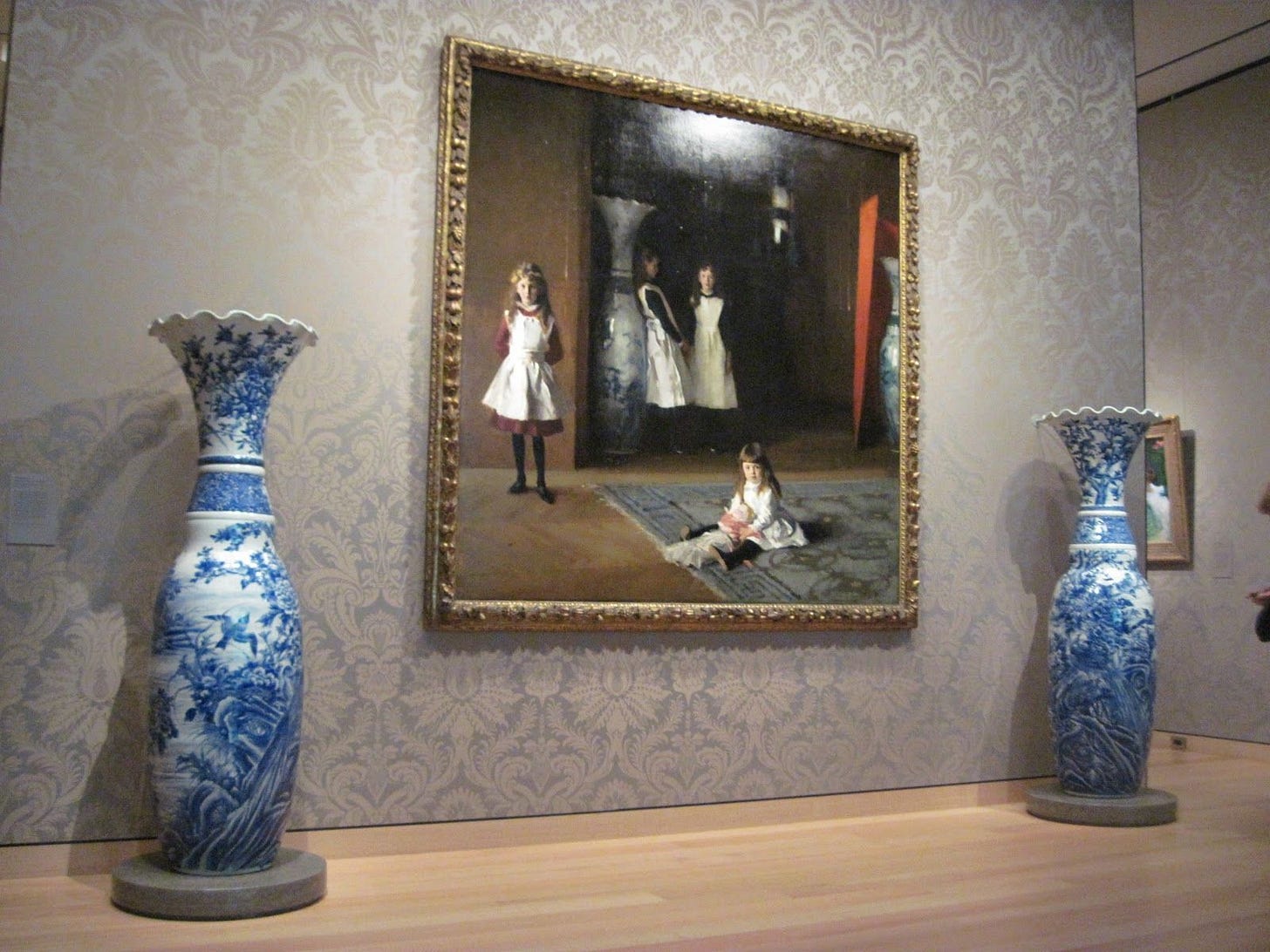
The portrait in question hasn’t been confirmed - but, come on, has to be - John Singer Sargent’s “The Daughters of Edward Darley Boit” from 1882. It’s an enormous portrait of a wealthy ex-pat’s four daughters, which prominently features two massive blue-and-white porcelain vases, positioned right alongside the human subjects. The painting resides at the Museum of Fine Arts Boston, and is even displayed flanked by those two vases, which were gifted along with the painting by the adult Boit daughters.

The reason these priceless vases are so vitally important to the painting is because they act as a brilliant narrative foil. They represent connoisseurship and craftsmanship of the highest order. Yet in the painting, one of them is being leaned up against by a fourteen-year-old who couldn’t care less about all that.
That’s what makes this painting so extraordinary. Sargent, who was only 26 at the time, set out to create a thoroughly modern, avant garde portrait. He wanted to capture these girls at their most authentic and idiosyncratic, even at the expense of accepted artistic convention. And it’s true, everything about this painting bucks convention. Beyond the chunky, off-center composition, the subjects are dressed in play clothes, hardly their finest - and feel as though they’re caught in a snapshot, rather than sitting for the ages. The sunshiny five-year-old hasn’t yet learned to be as dubious as her older sister, who stands with one foot tentatively forward. The fourteen-year-old’s face is fully obscured by shadows - remember, this is a portrait! - and yet her stubborn unwillingness to pose tells us everything about her - and any teenager, really - that we need to know.
Even the porcelain vases themselves are subject to the foibles of everyday life. Upon their arrival at the museum, curators found they were littered inside with ticket stubs and gum wrappers. It’s pretty much exactly what you would expect to find inside enormous vases from a house full of kids, and exactly what formal classical portraiture airbrushes out of human experience.
Yet when Lagerfeld says he’s capturing these vases straight out of Sargent, he’s very intentionally not capturing the detritus and the shadows. He’s crafting a sublime portrait - that is, of the vases. Lagerfeld is extolling the connoisseurship and craftsmanship that Sargent rejects. Lagerfeld all but doubles down, with thousands of hand-sewn blue and white and clear beads and crystals that required nearly two thousand hours of labor to sew. Here, it’s the fashion that is transcendent. The art, meanwhile, is pretty darn human.
So perhaps the categories of “art” and “fashion” can be complicated a bit, and even, as we’ve just seen, swap places. One thing we can say for certain is it seems that artists who harbor affection for the natural world (and don’t turn their backs to windows at restaurants, Piet) are a lot more comfortable expanding into fashion. They’re more ready to accept the imperfection of bodies, the unpredictability of our undulating human forms, and incorporate them into the fabric.
Take, for example, mid-century hard-edge Abstract Expressionist Ellsworth Kelly, who loved nature as much as Piet Mondrian hated it. This might not be obvious from a passing glance at their most iconic paintings. Both Kelly and Mondrian worked with abstract forms and incorporated simple shapes and pure colors into their art. How, you ask, can you tell that one liked trees and the other got nauseous at the sight of them?
Look at their paintings side-by-side. You can tell. It all comes down to the curves.

Mondrian, as we’ve already seen, used straight lines to transcend human experience. Kelly, on the other hand, believed that everything in nature can be distilled down to their essential shapes. For example, what looks at first glance like a heap of circles is actually a ring of oranges. A simple pencil line, expertly deployed, can capture a surprising amount of volume and weight.
This exquisite reduction of form became Kelly’s calling card. Everything - everything! - could be reduced to lines, shapes, and colors. And if the world can all be turned to art, then there is no longer a barrier between art and the world. Technique and materials become subject matter. A paint’s thickness, or the subtle ridges of a brushstroke, even the painted sides of a canvas, all became part of the painting’s narrative. So why wouldn’t this equally apply to clothing? How were fabric and stitching any different, any less a distillation of the world, than paint and canvas?
In 1952, early in his career, Kelly decided to test this theory out. He put down the paintbrush and instead put his energy into designing a sleeveless sheath dress of horizontal bands in black and white and red and blue.
The bars of colors ride the curves, transforming flat squares of fabric into a wearable sculpture, with the explicit purpose of giving that flatness dimension. Far from transcending the colors of the natural world, these colors quite literally reflect them: Kelly bought the brightly-colored, organically-dyed bolts of fabric from a small fishing village in the south of France where he was living, and left them unchanged, like paint squirted straight from the tube and applied directly to the canvas.
Being an artist, as Kelly quickly learned, doesn’t mean you’re a natural fashion designer. His original attempt at this dress, sewn by his artist friend Anne Weber, wasn’t quite what he envisioned (“the bottom panel was longer than the rest,” he said. “…[she] ruined it!”). Decades later, in 2013 Kelly would try again. This time he would partner with Francisco Costa, the woman’s creative director at Calvin Klein, to create the shift dress as it was always meant to be: equal parts precise and organic, utterly of its time and completely timeless. It was meant to be a piece of clothing that somehow defied fashion. The limited-edition dresses were donated exclusively to art museums.
It would seem that Kelly did it, right? Here we have, in our hot little hands, the pure nexus of clothing and art. Fashion that takes its place in a museum. But we can’t just stop here. It’s too easy, too obviously theory moved into practice. It completely ignores cloth’s extraordinarily magical capacities, not the least of which is its ability to move. Kelly brought us far, but it takes that little extra bit of genius to pull art off a gallery wall, and place it onto our bodies, and stride out into the world.
And no one did it better than Sonia Delaunay.
The Ukrainian-French Delaunay was an early-twentieth century abstract painter and clothing designer, with little daylight between the two. Both she and her husband, the French painter Robert Delaunay, were influenced by French contemporary theories of color, which the couple transformed into their own kaleidoscopic style that they branded “Simultanism.”
Simultanism was based on Sonia and Robert’s definition of the “dynamic simultaneity of colors” - that is, in their words, the phenomenon of two complementary colors, side-by-side, throbbing in a dynamic dance. Combine this dynamism, they implore you, with the colors of the world that bombard us constantly. They reckoned it was something we did easily and often - even after we close our eyes we can recreate these colors with a gentle push against our eyelids. It’s glorious, and biomorphic, and just a little pseudoscientific, but never mind that. For years, both Sonia and Robert experimented with how to visualize their philosophies, how to capture this continuous, simultaneous energy on an inert canvas:
They did their level best, with pulsing colors and dynamic compositions. But, heck, at a certain point, it just needed to move. And this is when Sonia turned to clothing. And I very intentionally say clothing, not fashion. Delaunay took colorful fabric swatches and sewed them together as though they were on a canvas, as though they were a canvas, obeying the rhythm of the colors rather than any intentional patterns.
Her first attempt at making a garment, “Simultaneous Dress” (and matching hat) from 1913, had nothing to do with the staid fashions of the moment, but instead reflected her own principles of Simultaneism. It’s like her paintings, suddenly, were wearable. And what’s more, by wearing them, moving in them, she actualized them. The garments were her paintings at their most authentic. “Make no mistake about it,” wrote the critic Claire Goll of Sonia in 1924’s Bilder Courier, “clothing too is a work of art!”
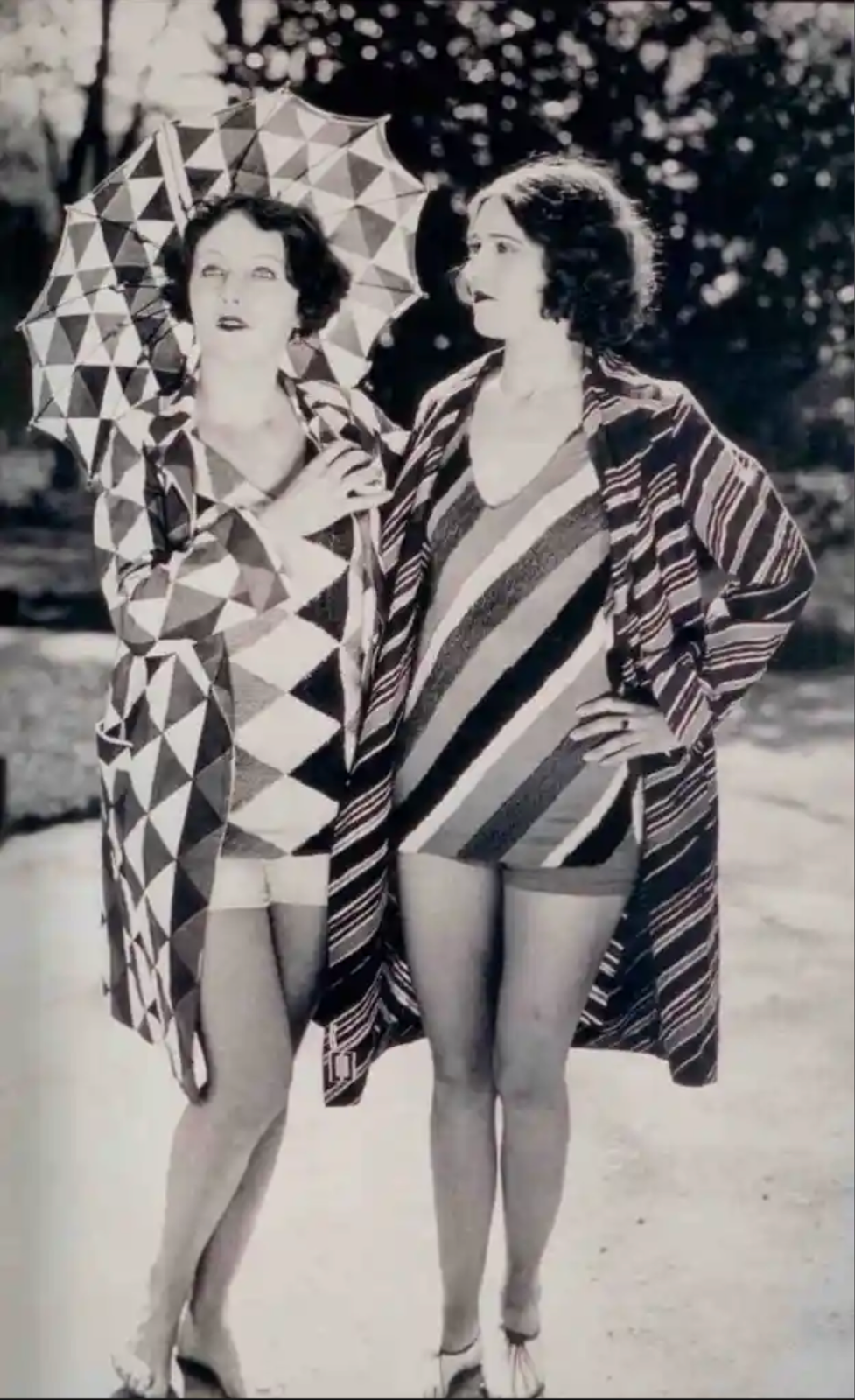
But in creating clothing that explicitly reflected her artistic vision, Sonia Delauney…made fashion. She became a costume designer for the Ballets Russes. She created her own textiles. By the mid-1920s she opened her own fashion house, called Sonia. And, maybe best of all, she made a kicky series of Simultaenism-Cubism-inspired bathing suits.
Seriously, how cute and retro are these? Which is wonderfully ironic, given how avant garde and abstract and ahead-of-her-time she was as a fashion designer, to the point where, within her lifetime (she died in 1979), she enjoyed a full-blown fashion revival. In the 1960s and 1970s, when her graphic patterns and flat silhouettes were all the rage, Sonia was back in vogue. And then another mini-revival again in 2018.
“I have lived my art,” Sonia Delaunay said in an interview. More specifically, she wore her art. And she saw no line between the two. She never let the utilitarian nature of the clothing compromise the integrity of her artistic vision. A painting pushed, stretched, and sculpted towards every possible dimension of creativity is, as it turns out, a dress.
By and large, art is art. Fashion is fashion. They solve different problems. They antagonize one another. Often they misunderstand each other. But they’re always in conversation with one another.
The beauty of fashion is something fine art is never afforded: its ability to cycle back, inserting itself in new contexts and extending its life into perpetuity. A painting is derivative, but a jacket is retro. So when fashion brings fine art along for the ride - Saint Laurent referencing Mondrian, Chanel reinterpreting Sargent, Dior continuing Delaunay - we as the audience are given something uniquely special: the opportunity to be provoked, perpetually, by a relationship that is imperfect and transcendent, curvy and abstract, and anything but simple.


Truly, thank you for this gift.
Thanks for the lovely article. It's really interesting to see how art and fashion can antagonize each other, and it seems like both are elevated by the tension. I'd never thought about commissioning something that I want to read, but it was a great idea!